
This is part 2, if you are looking for part 1, it is here.
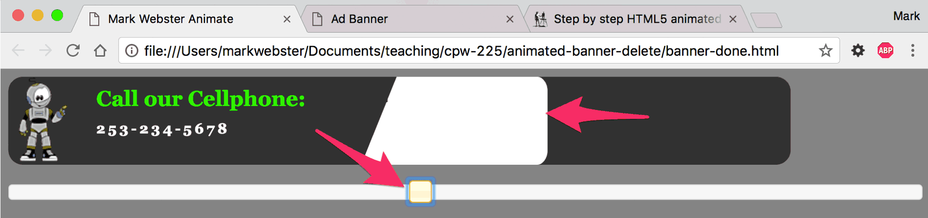
Sliding Reveal
Open banner-done.html and drag the playhead slider over until you see the white rectangle slide out from underneath the diagonal gray band.
To get all this to work we have to configure and style half a dozen different elements that currently don’t exist. The white rectangle (called #potato) with rounded corners is fairly obvious. But getting it to slide out from underneath a slanted rectangle (called #trapazoid2) means there has to be a slanted rectangle, and the rectangle has to exist on a higher level or layer (called z-index in CSS) than the white rectangle. And the slanted rectangle has to be big enough to cover the white rectangle, while simultaneously the white rectangle has to be wider than the slanted rectangle after it slides into view. It’s a lot to think about, but we will tackle it in stages.
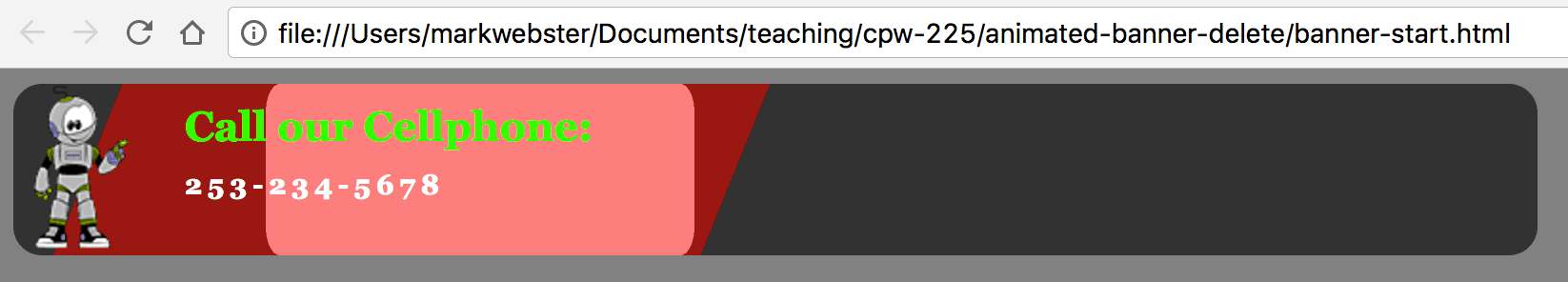
STEP ONE: Lets get the trapazoid2 and potato in place. Open banner-start.html and add two new elements called trapazoid2 and potato. It is lines 14 & 15 below:
<!--this is banner-start.html-->
<div id="banner">
   <div id="pitchWrapper">
	     <div id="quote">
	     	We make the best Mufflers
	     </div>
	     <div id="bouncyGreen">
	       in Tacoma
	     </div>
	</div><!--end pitchWrapper div-->
	<img src="images/simon2.png" alt="simon" id="simon">
	<h1 id="callUs">Call our Cellphone:</h1>
	<h2 id="phoneNumber">253-234-5678</h2>
	<div id="trapazoid2"></div><!-- new code -->
	<div id="potato"></div>	<!-- new code -->
 </div><!--end banner div-->
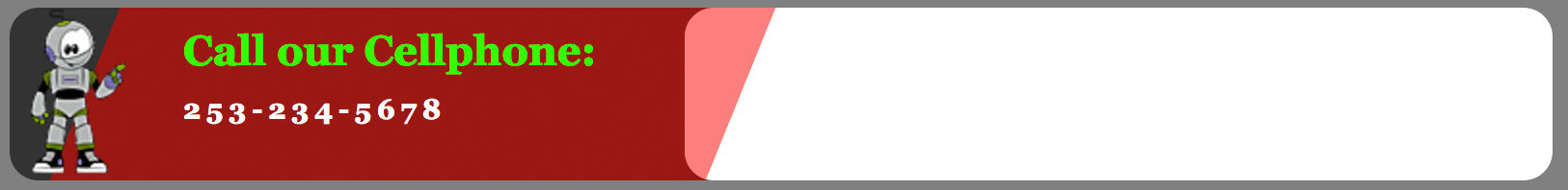
STEP TWO: On banner-start.css, add these two new rules below the other rules. Save your changes to both the html and css and view the animation.
/*banner-start.css*/
#trapazoid2{
	background-color: #f00;
	position:absolute;
	left:39px;
	top:0;
	height:90px;
	width:340px;
	margin:0;
	padding:0;
	-moz-transform: skew(-22deg, 0deg);
	-webkit-transform: skew(-22deg, 0deg);
	-o-transform: skew(-22deg, 0deg);
	-ms-transform: skew(-22deg, 0deg);
	transform: skew(-22deg, 0deg);
	opacity:0.5;
	z-index: 5;
}

#potato {
  height: 90px;
  width: 450px;
  background-color: #fff;
  -webkit-border-radius: 15px;
  -moz-border-radius: 15px;
  border-radius: 15px;
  position:absolute;
  left:20px;
  top:0;
   -ms-transform: scale(0.5,1); /* IE 9 */
   -webkit-transform: scale(0.5,1); /* Safari */
   transform: scale(0.5,1); /* Standard syntax */
  /*opacity: 0;*/
  z-index: 2;
}
This is what you will see after it has finished running:
 The style sheet is telling trapazoid2 to be temporarily red and transparent. This allows us to see the potato underneath it for testing. The potato has also been transformed horizontally (but not vertically) transform: scale(0.5,1); to half it’s normal width. This allows it to hide under the smaller trapazoid2 until it is needed.
To generate the transform properties, this website has a cool interactive code generator:
http://www.css3maker.com/css3-transform.html
STEP THREE: To make this project easier to understand, I’ve built a pdf that shows something close to what could be called storyboards. Open this pdf. I’m also embedding it in this site, but the pdf has better image quality.

The first time I taught this lesson to my students I had not built this storyboard. To say they were confused is an understatement. The most important thing to study here is the z-index settings for all the stacked up elements. Keep in mind that you can only apply z-index to an element that has been positioned, as in position: absolute, relative, fixed, etc.
STEP FOUR: Open banner-start.js and add this new line of code to the bottom (line 11). It will animate the #potato over into place. It works by scaling up the width to 100% and changing it’s location to an x value of 330: x:330, scaleX:1. To return to the lipstick analogy, the lipstick just moved out of the tube and is ready to use.
// this is banner-start.js
var mySplitText = new SplitText("#quote", {type:"words"});
var tl = new TimelineMax();
tl.to("#banner", 1.5, {opacity:1, ease:Cubic.easeOut})
.staggerFrom(mySplitText.words, 0.3, {opacity:0, scale:0.4,  ease:Back.easeOut}, 0.15)
.from("#bouncyGreen", 0.9,{opacity:0, y:50, ease:Elastic.easeOut, delay:0.5})
.to("#pitchWrapper", 1, {opacity:0, scale:0.3, y:22, ease:Back.easeIn, delay:0.5})
.from("#callUs", 0.5,{x:-430, ease:Cubic.easeOut, delay:0.5})
.from("#phoneNumber", 0.5,{x:-430, ease:Cubic.easeOut},"-=0.4")
.from("#simon", 0.5,{x:-100, ease:Cubic.easeOut},"-=0.4")
.to("#potato", 0.7,{x:330, scaleX:1, ease:Cubic.easeOut})
STEP FIVE: Now that we know our #potato is hiding and animating correctly, lets make the #trapazoid2 element fully opaque, and set it’s background color to the same as the #banner. We want it there to hide the #potato, but it should blend into the background…like a flesh colored bandaid over a blemish. Open banner-start.css and modify the opacity and background-color settings. Also, add a rule that gives the #pitchWrapper a z-index setting of 9.
/*this is banner-start.css*/
#trapazoid2{
	background-color: #333;/* new code */
	position:absolute;
	left:39px;
	top:0;
	height:90px;
	width:340px;
	margin:0;
	padding:0;
	-moz-transform: skew(-22deg, 0deg);
	-webkit-transform: skew(-22deg, 0deg);
	-o-transform: skew(-22deg, 0deg);
	-ms-transform: skew(-22deg, 0deg);
	transform: skew(-22deg, 0deg);
	opacity:1;/* new code */
	z-index: 5;
}
#pitchWrapper{/* new rule */
 position:absolute;
 left:0;
 top:0;
 z-index: 9;
}
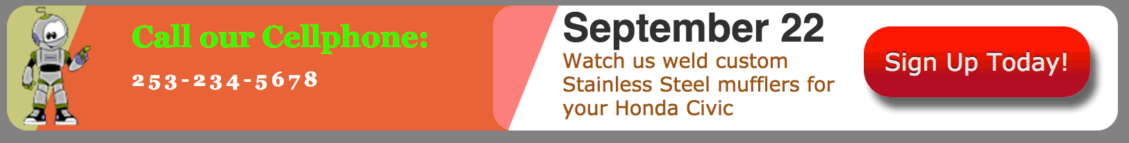
With that we are getting quite close. All we are missing is the 3 elements that slide out from under the #trapazoid2. They need to be configured so that they are under #trapazoid2, but over the #potato. We will do that with z-index settings. First we have to get them in there with HTML markup, and then hide them with CSS.
STEP SIX: On banner-start.html, add the following 3 new elements, lines 15 thru 19 below:
<div id="banner">
	<div id="pitchWrapper">
		<div id="quote">
			We make the best Mufflers
		</div>
		<div id="bouncyGreen">
			in Tacoma
		</div>
	</div><!--end pitchWrapper div-->
	<img src="images/simon2.png" alt="simon" id="simon">
	<h1 id="callUs">Call our Cellphone:</h1>
	<h2 id="phoneNumber">253-234-5678</h2>
	<div id="trapazoid2"></div>
	<div id="potato"></div>
	<h1 id="theDate">September 22</h1><!-- new code -->
	<div id="description"><!-- new code -->
		Watch us weld custom Stainless Steel mufflers for your Honda Civic
	</div>
	<a href="http://www.websterart.com" id="signUp">Sign Up Today!</a> <!-- new code -->

</div><!--end banner div-->
STEP SEVEN: On banner-start.css, add these three new rules below all the other rules. There is a lot of code this time because the button a#signUp is made with CSS 3 gradients:
h1#theDate {
	font-family: Arial, Helvetica, sans-serif;
	font-size: 2em;
	color:#333;
	position:absolute;
	left: 200px;
	top:0px;
	margin:0;
	padding:0;
	z-index: 3;
}

#description {
	position:absolute;
	left:150px;
	top:31px;
	margin:0;
	padding:0;
	color:#9E5111;
	width:200px;
	z-index: 4;
}
#banner a#signUp {
	display:block;
	position:absolute;
	top:15px;
	right:20px;
	color: rgb(230, 230, 230);
	font-size: 1.2em;
	text-decoration: none;
	padding: 15px;
	text-shadow: 0px -1px 0px rgba(30, 30, 30, 0.8);
	-webkit-border-radius: 19.864864864864863px;
	-moz-border-radius: 19.864864864864863px;
	border-radius: 19.864864864864863px;
	background: rgb(176, 1, 42);
	background: -moz-linear-gradient(90deg, rgb(176, 1, 42) 30%, rgb(250, 20, 0) 70%);
	background: -webkit-linear-gradient(90deg, rgb(176, 1, 42) 30%, rgb(250, 20, 0) 70%);
	background: -o-linear-gradient(90deg, rgb(176, 1, 42) 30%, rgb(250, 20, 0) 70%);
	background: -ms-linear-gradient(90deg, rgb(176, 1, 42) 30%, rgb(250, 20, 0) 70%);
	background: linear-gradient(0deg, rgb(176, 1, 42) 30%, rgb(250, 20, 0) 70%);
	-webkit-box-shadow: 5px 8px 7px rgba(50, 50, 50, 0.75);
	-moz-box-shadow:    5px 8px 7px rgba(50, 50, 50, 0.75);
	box-shadow:         5px 8px 7px rgba(50, 50, 50, 0.75);
   -ms-transform: scale(0.3,0.3); /* IE 9 */
   -webkit-transform: scale(0.3,0.3); /* Safari */
   transform: scale(0.3,0.3); /* Standard syntax */
/*http://css3gen.com/button-generator/*/
	opacity:0;
	z-index: 10;

}
Note that you can’t see them. It is helpful to be able to see them in case you need to tweak their position when you use different text copy.
STEP EIGHT: On banner-start.css, make the #trapazoid2 transparent and red, also temporarily change the background color of #banner to a butterscotch color (not shown):
#trapazoid2{
	background-color: #f00;/* new code */
	position:absolute;
	left:39px;
	top:0;
	height:90px;
	width:340px;
	margin:0;
	padding:0;
	-moz-transform: skew(-22deg, 0deg);
	-webkit-transform: skew(-22deg, 0deg);
	-o-transform: skew(-22deg, 0deg);
	-ms-transform: skew(-22deg, 0deg);
	transform: skew(-22deg, 0deg);
	opacity:0.5;/* new code */
	z-index: 5;
}
STEP NINE: On banner-start.js, add these four new commands, shown as lines 12 to 15below. Save the file and view the animation.
// this is banner-start.js
var mySplitText = new SplitText("#quote", {type:"words"});
var tl = new TimelineMax();
tl.to("#banner", 1.5, {opacity:1, ease:Cubic.easeOut})
.staggerFrom(mySplitText.words, 0.3, {opacity:0, scale:0.4,  ease:Back.easeOut}, 0.15)
.from("#bouncyGreen", 0.9,{opacity:0, y:50, ease:Elastic.easeOut, delay:0.5})
.to("#pitchWrapper", 1, {opacity:0, scale:0.3, y:22, ease:Back.easeIn, delay:0.5})
.from("#callUs", 0.5,{x:-430, ease:Cubic.easeOut, delay:0.5})
.from("#phoneNumber", 0.5,{x:-430, ease:Cubic.easeOut},"-=0.4")
.from("#simon", 0.5,{x:-100, ease:Cubic.easeOut},"-=0.4")
.to("#potato", 0.7,{x:330, scaleX:1, ease:Cubic.easeOut})
.to("#theDate", 0.5,{x:200, ease:Cubic.easeOut})
.to("#description", 0.5,{x:250, ease:Cubic.easeOut},"-=0.4")
.to("#signUp", 0.8,{opacity:1, scale:1, ease:Elastic.easeOut, delay:0.8})
.to("#banner", 0.5,{autoAlpha:0,delay:5});
The last line in the script above tells the banner to hide after 5 seconds. Typically ads run for two loops, and then stop. You can make them run indefinitely, but that is frowned on as a best practice.
STEP TEN: On banner-start.css, change the background color of #banner back to #333. Also, on #trapazoid2, change the opacity to 1, and the background-color to #333. View the animation and it should be perfect…except that it fades out completely…again, not a perfect user experience.
STEP ELEVEN: On banner-start.js, modify this line:
var tl = new TimelineMax();
so that it looks like this:
var tl = new TimelineMax({repeat:-1});
The repeat:-1 tells the animation to loop forever. That is better than it was, but it would be even better if we could tailor the repeats to exactly the number our client requests. For that to work, we have to put a counter in our code that checks to see how many times the animation has looped, and stops it after the desired number of loops.
STEP TWELVE: On banner-start.js, add two variables called loop, and loopMax, shown as lines 4 & 5 below. If you have ever written a for loop, you will know that we set up a statement that initializes the variable value (var loop = 0), compares current value of loop to the max (loopMax < 2), and increments the variable up 1 number (loop plus 1). Then the for loop runs again, repeating the comparing and incrementing.
for (var i=0, i < 2, i++) {
loop the animation
}
// this is banner-start.js
var mySplitText = new SplitText("#quote", {type:"words"});
var tl = new TimelineMax({repeat:-1});
loop =0;
loopMax = 2;
tl.to("#banner", 1.5, {opacity:1, ease:Cubic.easeOut})
.staggerFrom(mySplitText.words, 0.3, {opacity:0, scale:0.4,  ease:Back.easeOut}, 0.15)
.from("#bouncyGreen", 0.9,{opacity:0, y:50, ease:Elastic.easeOut, delay:0.5})
.to("#pitchWrapper", 1, {opacity:0, scale:0.3, y:22, ease:Back.easeIn, delay:0.5})
.from("#callUs", 0.5,{x:-430, ease:Cubic.easeOut, delay:0.5})
.from("#phoneNumber", 0.5,{x:-430, ease:Cubic.easeOut},"-=0.4")
.from("#simon", 0.5,{x:-100, ease:Cubic.easeOut},"-=0.4")
.to("#potato", 0.7,{x:330, scaleX:1, ease:Cubic.easeOut})
.to("#theDate", 0.5,{x:200, ease:Cubic.easeOut})
.to("#description", 0.5,{x:250, ease:Cubic.easeOut},"-=0.4")
.to("#signUp", 0.8,{opacity:1, scale:1, ease:Elastic.easeOut, delay:0.8})
.to("#banner", 0.5,{autoAlpha:0,delay:5});
STEP THIRTEEN: On banner-start.js, insert this command .call(loopCheck) on an empty line before .to(“#banner”,…..), line 17. And also add in the function loopCheck(){}., lines 20 thru 30. Save the file and run the animation.
// this is banner-start.js
var mySplitText = new SplitText("#quote", {type:"words"});
var tl = new TimelineMax({repeat:-1});
loop =0;
loopMax = 2;
tl.to("#banner", 1.5, {opacity:1, ease:Cubic.easeOut})
.staggerFrom(mySplitText.words, 0.3, {opacity:0, scale:0.4,  ease:Back.easeOut}, 0.15)
.from("#bouncyGreen", 0.9,{opacity:0, y:50, ease:Elastic.easeOut, delay:0.5})
.to("#pitchWrapper", 1, {opacity:0, scale:0.3, y:22, ease:Back.easeIn, delay:0.5})
.from("#callUs", 0.5,{x:-430, ease:Cubic.easeOut, delay:0.5})
.from("#phoneNumber", 0.5,{x:-430, ease:Cubic.easeOut},"-=0.4")
.from("#simon", 0.5,{x:-100, ease:Cubic.easeOut},"-=0.4")
.to("#potato", 0.7,{x:330, scaleX:1, ease:Cubic.easeOut})
.to("#theDate", 0.5,{x:200, ease:Cubic.easeOut})
.to("#description", 0.5,{x:250, ease:Cubic.easeOut},"-=0.4")
.to("#signUp", 0.8,{opacity:1, scale:1, ease:Elastic.easeOut, delay:0.8})
.call(loopCheck)
.to("#banner", 0.5,{autoAlpha:0,delay:5});

function loopCheck(){
	//console.log("loopCheck")
	loop++;
	if (loop < loopMax) {
		//console.log("play again")
		tl.play();
	} else{
		//console.log("done")
		tl.pause();
	}
}
By inserting the .call(loopCheck) command before the .to(“#banner”) command, we allow our counter to do a quick check of how many loops have happened. If the loop variable value has been incremented up to a value of 2, the loopCheck function cycles through to the else statement, which tells the timeline (tl) to pause before gettting to the last command. This leaves our banner visible for someone to click the button…now that all the motion has stopped.
STEP FOURTEEN: The button is already clickable, but wouldn’t it be nice if we could attach a cute little animation to the hover state? As the greensock people would say: “No problem!”. Add this new code to the top of banner-start.js. This code finds the element with the #signUp id, which is the red button, and tells it to have a handy little roll-over, roll-off effect.
register = document.getElementById("signUp");

signUp.onmouseenter = function() {
  TweenLite.to(signUp, 0.2, {scale:1.2})
}

signUp.onmouseleave = function() {
  TweenLite.to(signUp, 0.2, {scale:1})
}
Nice Work!
You now have a functioning horizontal banner ad. It’s not responsive…so if that causes problems, you will need to make a vertical version of it, and hide the horizontal one for smartphones via some media queries.
In conclusion, here is all the code from banner-start.js:
// this is banner-start.js
register = document.getElementById("signUp");

signUp.onmouseenter = function() {
  TweenLite.to(signUp, 0.2, {scale:1.2})
}

signUp.onmouseleave = function() {
  TweenLite.to(signUp, 0.2, {scale:1})
}
var mySplitText = new SplitText("#quote", {type:"words"});
var tl = new TimelineMax({repeat:-1});
loop =0;
loopMax = 2;
tl.to("#banner", 1.5, {opacity:1, ease:Cubic.easeOut})
.staggerFrom(mySplitText.words, 0.3, {opacity:0, scale:0.4,  ease:Back.easeOut}, 0.15)
.from("#bouncyGreen", 0.9,{opacity:0, y:50, ease:Elastic.easeOut, delay:0.5})
.to("#pitchWrapper", 1, {opacity:0, scale:0.3, y:22, ease:Back.easeIn, delay:0.5})
.from("#callUs", 0.5,{x:-430, ease:Cubic.easeOut, delay:0.5})
.from("#phoneNumber", 0.5,{x:-430, ease:Cubic.easeOut},"-=0.4")
.from("#simon", 0.5,{x:-100, ease:Cubic.easeOut},"-=0.4")
.to("#potato", 0.7,{x:330, scaleX:1, ease:Cubic.easeOut})
.to("#theDate", 0.5,{x:200, ease:Cubic.easeOut})
.to("#description", 0.5,{x:250, ease:Cubic.easeOut},"-=0.4")
.to("#signUp", 0.8,{opacity:1, scale:1, ease:Elastic.easeOut, delay:0.8})
.call(loopCheck)
.to("#banner", 0.5,{autoAlpha:0,delay:5});

function loopCheck(){
	//console.log("loopCheck")
	loop++;
	if (loop < loopMax) {
		//console.log("play again")
		tl.play();
	} else{
		//console.log("done")
		tl.pause();
	}
}
Here is all the code from banner-start.html:
<!doctype html>
<html>
<head>
<meta charset="UTF-8">
<title> Ad Banner </title>
<link rel="stylesheet" type="text/css" media="screen" href="banner-start.css">

</head>
<body>
 <div id="banner">
   <div id="pitchWrapper">
	     <div id="quote">
	     	We make the best Mufflers
	     </div>
	     <div id="bouncyGreen">
	       in Tacoma
	     </div>
	</div><!--end pitchWrapper div-->
	<img src="images/simon2.png" alt="simon" id="simon">
	<h1 id="callUs">Call our Cellphone:</h1>
	<h2 id="phoneNumber">253-234-5678</h2>
	<div id="trapazoid2"></div><!-- new code -->
	<div id="potato"></div>	<!-- new code -->
	<h1 id="theDate">September 22</h1>
	<div id="description">
		Watch us weld custom Stainless Steel mufflers for your Honda Civic
	</div>
	<a href="http://www.websterart.com" id="signUp">Sign Up Today!</a>

 </div><!--end banner div-->

<script src="js/jquery-1.10.1.min.js"></script>
<script src="js/jqueryUI/js/jquery-ui-1.10.3.custom.min.js"></script>
<script src="js/TweenMax.min.js"></script>
<script src="js/SplitText.min.js"></script>
<script src="js/banner-start.js"></script>

</body>
</html>
And here is the entire banner-start.css code:
/******* this is banner-start.css ********/
body {
	background-color: gray;
}
#banner {
	height: 90px;
	width: 800px;
	background-color: #333;
	border-radius: 15px;
	position: relative;
	opacity: 0;
	font: 0.9em Verdana, Helvetica, sans-serif;
	color: white;
	/*overflow: hidden;*/
}
#quote {
	font:1.5em Verdana, Helvetica, sans-serif;
	font-style: bold;
	color: #ccc;
	float: left;
	letter-spacing: 0.08em;
	margin: 25px 0 0 10px;
}

#bouncyGreen {

	font:3em Georgia, Times, serif;
	float: left;
	color: #0f0;
	margin: 10px 0 0 0;/*0ld was margin-top:-11px*/
	padding:0;
}

#simon{
	position:absolute;
	left:10px;
	top:0px;
	margin:0;
	padding:0;
	z-index: 6;
}

h1#callUs{
	font-family: Georgia, Times, serif;
	font-size: 1.5em;
	color:#0f0;
	position:absolute;
	left: 90px;
	top:10px;
	margin:0;
	padding:0;
	z-index:8;
}
h2#phoneNumber{
	font-family: Georgia, Times, serif;
	font-size: 1.0em;

	letter-spacing: 3px;
	color:#fff;
	position:absolute;
	left:90px;
	top:45px;
	margin:0;
	padding:0;
	z-index:7;
}
#trapazoid2{
	background-color: #333;
	position:absolute;
	left:39px;
	top:0;
	height:90px;
	width:340px;
	margin:0;
	padding:0;
	-moz-transform: skew(-22deg, 0deg);
	-webkit-transform: skew(-22deg, 0deg);
	-o-transform: skew(-22deg, 0deg);
	-ms-transform: skew(-22deg, 0deg);
	transform: skew(-22deg, 0deg);
	opacity:1;/* new code */
	z-index: 5;
}
#pitchWrapper{
position:absolute;
left:0;
top:0;
z-index: 9;
}
#potato {
  height: 90px;
  width: 450px;
  background-color: #fff;
  -webkit-border-radius: 15px;
  -moz-border-radius: 15px;
  border-radius: 15px;
  position:absolute;
  left:20px;
  top:0;
   -ms-transform: scale(0.5,1); /* IE 9 */
   -webkit-transform: scale(0.5,1); /* Safari */
   transform: scale(0.5,1); /* Standard syntax */
  /*opacity: 0;*/
  z-index: 2;
}
h1#theDate {
	font-family: 'Abel', sans-serif;
	font-size: 2em;
	/*font-family: 'Gravitas One', cursive;
	font-family: 'Sonsie One', cursive;*/
	color:#333;
	position:absolute;
	left: 200px;
	top:0px;
	margin:0;
	padding:0;
	z-index: 3;
}

#description {
	position:absolute;
	left:150px;
	top:31px;
	margin:0;
	padding:0;
	color:#9E5111;
	width:200px;
	z-index: 4;
}
#banner a#signUp {
	display:block;
	position:absolute;
	top:15px;
	right:20px;
	color: rgb(230, 230, 230);
	font-size: 1.2em;
	text-decoration: none;
	padding: 15px;
	text-shadow: 0px -1px 0px rgba(30, 30, 30, 0.8);
	-webkit-border-radius: 19.864864864864863px;
	-moz-border-radius: 19.864864864864863px;
	border-radius: 19.864864864864863px;
	background: rgb(176, 1, 42);
	background: -moz-linear-gradient(90deg, rgb(176, 1, 42) 30%, rgb(250, 20, 0) 70%);
	background: -webkit-linear-gradient(90deg, rgb(176, 1, 42) 30%, rgb(250, 20, 0) 70%);
	background: -o-linear-gradient(90deg, rgb(176, 1, 42) 30%, rgb(250, 20, 0) 70%);
	background: -ms-linear-gradient(90deg, rgb(176, 1, 42) 30%, rgb(250, 20, 0) 70%);
	background: linear-gradient(0deg, rgb(176, 1, 42) 30%, rgb(250, 20, 0) 70%);
	-webkit-box-shadow: 5px 8px 7px rgba(50, 50, 50, 0.75);
	-moz-box-shadow:    5px 8px 7px rgba(50, 50, 50, 0.75);
	box-shadow:         5px 8px 7px rgba(50, 50, 50, 0.75);
   -ms-transform: scale(0.3,0.3); /* IE 9 */
   -webkit-transform: scale(0.3,0.3); /* Safari */
   transform: scale(0.3,0.3); /* Standard syntax */
/*http://css3gen.com/button-generator/*/
	opacity:0;
	z-index: 10;

}
You can see both the horizontal and vertical versions of this ad running here.
http://websterart.com/html/animation-v4.php
I also have media queries in place that hide the horizontal and show the vertical if you arrive on a phone. If you like this tutorial, feel free to share it with your programmer friends. I wrote this one as a lesson plan for my students.