
HTML 5 animation tutorial
This tutorial will walk you through the process of building an 800 by 100px animated banner. We will start from scratch using a logo made in Photoshop. All the text will be styled and positioned with CSS 3 and HTML 5. The animation will be handled by making function calls into the Greensock JavaScript library.
We will be writing JavaScript, but it will be significantly dumbed down. The libraries will handle all the behind the scenes complexity. For example, we can tell something to move by simply saying: “move this logo 300 pixels over the course of 1 second, and have it bounce as it comes to a stop”. It won’t be quite that simple…but the code will clearly make sense.
We won’t have to script out the decreasing incremental movements that simulate easing during a bounce, like we used to have to do in Actionscript 3 in Flash. All of that complex math will be handled by pre-written libraries. We simply ask for the type of bounce we want, name the object that needs to bounce, save the file, and refresh the browser. We could do this animation in CSS 3, but at this point in time (2020) , scheduling events on a CSS timeline is very cumbersome.
The JavaScript library developed by the fine people at http://www.greensock.com makes animating over time as easy as it can be in these post flash days. For those of you who do remember the flash playhead, greensock has re-invented it, but using script. You get the draggable playhead, for testing the relationship of moving objects over the course of time. You can drag the playhead both forward and back. This makes it easy to see if your intervals and overlaps are matching your storyboards. I have provided a finished file both with and without the playhead in the lesson files.
Animation Storyboards
We won’t be using storyboards, but keep in mind that most animations start with storyboards. If you’ve never seen one, a storyboard is a series of stick figure cartoons, like a comic book page.
An animation banner typically starts with a client who has something to sell. There is usually an image involved, accompanied by some descriptive text. Planning the sequence of animated events that will sell the product typically starts with a storyboard.
For this tutorial, I’m going to give you the finished animation along with it’s supporting files in a zip file. It will contain the before and after files required to view and build this animated banner. But be aware that to move this animation up to your web server, you will need to be familiar with ftp file management applications, such as filezilla, cPanel or Dreamweaver.
Here is the zip file:
http://websterart.com/video/animated-banner.zip
If you are in my college class, it will be a sub folder in resources named animated-banner. Copy that folder to a location on your hardrive, desktop or network where you normally develop websites.
We will reverse engineer it, then re-build it from scratch. This is my attempt at a copy of an animation that Greensock used to feature on their front page. To my knowledge, he has never explained how he did it. I discovered it back when I was transitioning from flash banners to JavaScript. I wanted to turn my students on to what was being done in HTML 5. Greensock has many tutorials on their website, but I was unable to find a detailed explanation of how he did this one. I am constantly re-inventing and re-imagining my lessons to keep them current for my students. This tutorial grew out of the need to illustrate…in detail…how to do a state of the art HTML 5 animation.
The process I used to reverse engineer it can be used on any animation. Because it was a fast running animation with some exquisitely timed transitions, it was very challenging to figure out the timing. I needed a playhead to examine the movements in tiny increments. My solution was to record it with screen capture software. There are numerous programs out there, including some free ones, but I used Camtashia. Once I had it recorded, I exported it as an mp4 and had my playhead.
Once I could examine it in slow motion, I built an illustrated storyboard showing all the various elements and how they related to each other over the course of the 10 second animation. I made the illustrations for the storyboard by simply pausing the video and taking screenshots.
I pasted the screenshots into Illustrator, then exported the Illustrator file as a PDF.
Here it is:
Open this pdf. I’m also embedding it in this site, but the pdf has better image quality.

With experience and knowledge you can skip some of these steps…but for a beginner, or if the project is super complex, it’s always good to start with a storyboard.
I’ve always found it ironic that Steve Jobs forced us away from flash into JavaScript. Back in the day I could tell you to start flash and set up a new document on the timeline. Now, to start animating with JavaScript we basically have to create the flash environment entirely with script. It’s not just one or two files, like it used to be with flash. To animate with JavaScript, we need at least a dozen different files, and they all need to communicate with each other. Accurate file management is just one of many skills needed to animate in HTML 5.
If you are using a code editor such as Sublime or Brackets, make sure that those editors open with empty sidebars and zero files open. In Sublime, for example, it typically starts up with the last used files open, and the last defined project files listed in the sidebar. Each editor is different, but do what you have to do to close old files, and remove old project folders from the sidebar. If you don’t know how, ask Uncle Google.
Dreamweaver has some distinct advantages for developing animations, however at this time I don’t have Dreamweaver, so I will be using Sublime.
Getting Started
STEP 1: Open the banner-done.html in your browser and watch it run, note that you can drag the slider bar to control the animation, and that it keeps up with the animation automatically if you hit refresh.
banner and playhead
For those of you in my college class, we learned how to set up the slider bar in chapter 3A of the greensock textbook:
https://www.nobledesktop.com/books/gsap
This lesson will show you how to build an animated banner similar to this: https://codepen.io/GreenSock/pen/zGBgov
or this: http://websterart.com/html/animation-v4.php
STEP 2: Close banner-done.html and open banner-start.html in Chrome or Firefox. The banner-start.html will be a blank window in the browser, this is normal.
STEP 3: Right click in the blank browser window and choose view > source. This will open a new tab showing the source code. Note all the links to external files. Lines 6, 12, 13, 14, 15 and 16 all have links to external files. These files get imported by the browser and are essential for the animation to work. If you like analogies, think of the the engine in your car. If you took it out and set it on the floor, it wouldn’t run. It has to mounted in the car, and it has to be connected to the battery, the gas tank, the air cleaner, the fuel pump…etc.
Our banner-start.html has to be connected to those 6 files before we can make it run. Those files are all (except the css file) JavaScript files, and they are all (with one exception) prewritten JavaScript libraries that we will never touch.

click the links in view source page
STEP 4: Click each of the links and make sure that the browser can open the linked files. They should open easily. This means you have all the necessary files and folder for the project. Close the new tab or click the browsers back button after checking each link. If the links don’t open, examine the folder using Windows Explorer or the Mac Finder. Your folder structure must look like this for you to be able to click the links in the view source window. NOTE: this screen shot is from a Mac, but windows explorer view is almost identical.
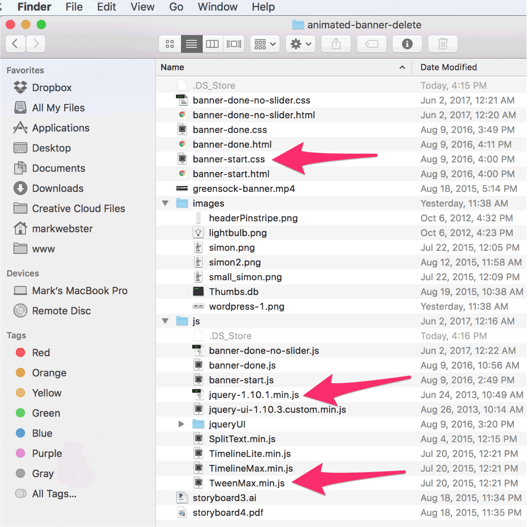
required directory structure
STEP 5: Examine the directory structure above and note that I have reorganized the locations of all of the linked css and javascript files (as compared to the optional greensock book). The two files I did not move were the jquery-ui files: js and css. Those files make the dragable playhead slider work. It’s very complex, so I left them buried in their original folder structure. Remember that to make this work online that specific directory structure has to be maintained up on the remote server. It will take some careful file management during the uploading process.
NOTE: You can work this tutorial without buying the greensock book. My previous students and I figured it all out by watching his excellent youtube channel. But his book makes it soooo much easier, I highly recommend you buy the book.
STEP 6: In your code editor, open these three files from your folder:
- banner-start.html
- banner-start.js
- banner-start.css
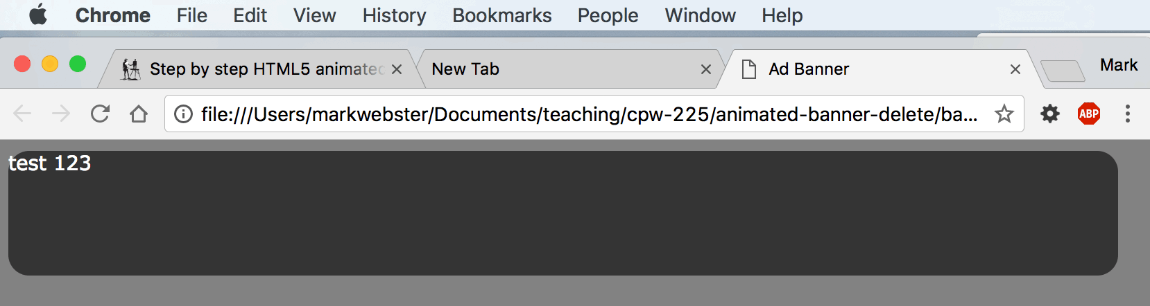
On banner-start.html, inside the <body></body> tags, start and stop a div with an id of banner. It will look like this when you are done:
<!--
this is banner-start.html
-->
<body>
  <div id="banner"> test 123
  </div><!--end banner div-->
<!-- bunch of script imports will be here already -->
</body>
STEP 7: Add these two rules to banner-start.css. Save the file and refresh your browser.
/*******
this is banner-start.css
********/
body {
  background-color: gray;
}
#banner {
   height: 90px;
   width:800px;
   background-color: #333;
   border-radius: 15px;
   position: relative;
   /*opacity: 0;*/
   font: 0.9em Verdana, Helvetica, sans-serif;
   color: white;
   /*overflow: hidden;*/
}
This is what you should see:
round corner banner box
STEP 8: In banner-start.css, un-comment (activate) the declaration for opacity: 0; like this:
/******* this is banner-start.css ********/
body {
	background-color: gray;
}
#banner {
	height: 90px;
	width: 800px;
	background-color: #333;
	border-radius: 15px;
	position: relative;
	opacity: 0; /*this is now active!*/
	font: 0.9em Verdana, Helvetica, sans-serif;
	color: white;
	/*overflow: hidden;*/
}
and refresh your page, you should see nothing. Next we will animate in the appearance of the banner.
STEP 9: Switch to banner-start.js. This is one of the six JavaScript files we are importing into banner-start.html. It is currently blank because we are just starting the script that will create the magic. Add the code shown below. Refresh your page and you should see the banner rectangle fade in over 1.5 seconds.
/*banner-start.js*/
var tl = new TimelineMax();
tl.to("#banner", 1.5, {opacity:1, ease:Cubic.easeOut})
Basically we are creating a new
variable called “tl“. We are assigning
it a new occurence of a virtual timeline called TimelineMax. You can think of this as a Flash or Premiere timeline if you know either of those programs. In the tl.to() statement we are saying, animate the <div id=”banner”> element over the course of 1.5 seconds from it’s starting opacity: 0; property (as defined in the style sheet ) to an opacity of 1. And we are using a prebuilt easing called “Cubic”. If you don’t know what easing is, check it out here: https://greensock.com/ease-visualizer
or here:
We can write this simple animation code because we are accessing the TimelineMax JavaScript libraries, which were already imported. We could do all this with CSS transforms, or jQuery animations…but greensock simply makes it easier.
A lot of what we are doing will not make sense unless you have either read the greensock book, or watched his tutorial videos on: https://www.youtube.com/user/GreenSockLearning
The sales pitch
STEP 10: Open banner-done.html in your browser. Note that as it runs there is a white playhead moving in time with the animation. The playhead was created with jQuery, JavaScript and the greensock libary all working together. It is explained in detail in the greensock book referenced above. In the image pictured below, I’ve grabbed the playhead and dragged it until the fourth word (best) is just beginning to appear. It has been programmed to grow and appear into place from zero opacity and a small size. The words appear sequentially via a super cool greensock library called splitText. It is one of the *js libraries we are already importing. To make them animate in, we have to write a line of script that targets that sentence. And by target, I mean we will surround that sentence with a div named: quote, then speak to the name of the div with JavaScript.
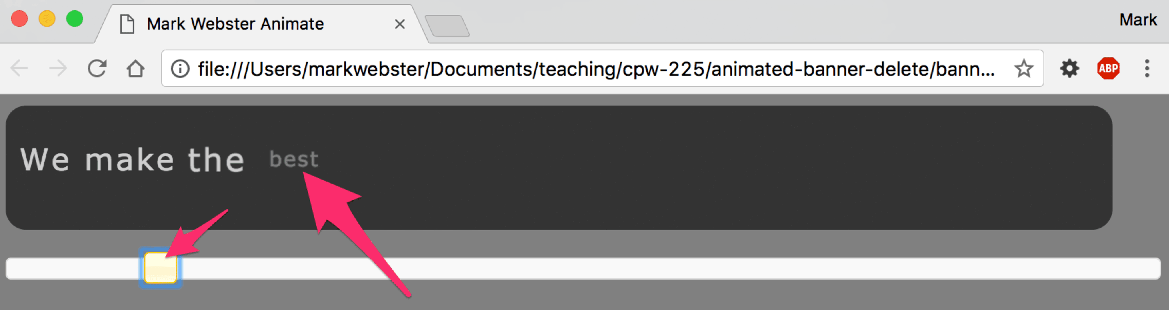
wordpress-split-text
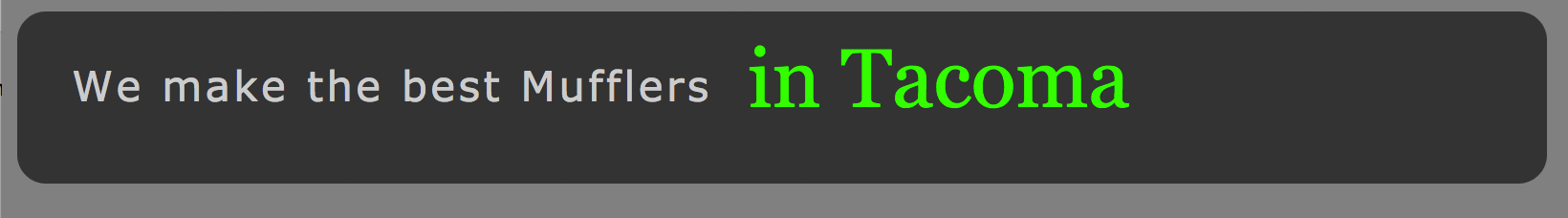
STEP 11: On banner-start.html, get rid of the “123” inside the banner div. Add a pitchWrapper div, and two div’s inside that as shown.
<!--this is banner-start.html-->
<div id="banner">
   <div id="pitchWrapper">
     <div id="quote"><!--this div will be animated with splitText-->
        We make the best Mufflers
     </div>
      <div id="bouncyGreen">
        in Tacoma
      </div>
   </div><!--end wrapper div-->
</div><!--end banner div-->
STEP 12: Switch to banner-start.css, add the following two new style sheet rules below the existing rules. Note that both elements #quote, #bouncyGreen have a float: left; property. Because #bouncyGreen div comes after #quote, #bouncyGreen is the last one to float into place, and ends up on the right, exactly where we want it.
/*this is banner-start.css
There is code above this...
*/
#quote {
	font:1.5em Verdana, Helvetica, sans-serif;
	font-style: bold;
	color: #ccc;
	float: left;
	letter-spacing: 0.08em;
	margin: 25px 0 0 10px;
}

#bouncyGreen {

	font:3em Georgia, Times, serif;
	float: left;
	color: #0f0;
	margin: 10px 0 0 0;/*0ld was margin-top:-11px*/
	padding:0;
}
STEP 13: Switch to banner-start.js. Add the the code shown below. The new code is on lines 2 and 5. Save the file and refresh the browser on banner-start.html. You should see the words “We make the best mufflers” animate in one after the other, separated by about a tenth of a second.
//this is banner-start.js
var mySplitText = new SplitText("#quote", {type:"words"});
var tl = new TimelineMax();
tl.to("#banner", 1.5, {opacity:1, ease:Cubic.easeOut})
.staggerFrom(mySplitText.words, 0.3, {opacity:0, scale:0.4,  ease:Back.easeOut}, 0.15)
Explanation: Line two creates a new variable called mySplitText. It makes a new occurrence of the greensock SplitText function. The function targets the #quote div, and specifies that the type of splitting that shall occur is words, instead of individual letters. The SplitText function breaks apart the sentence into individual div elements so that each can be animated separately. Line five uses the greensock staggerFrom function. The staggerFrom function means to separate out the words into staggered animations, each separated from the previous word by 0.15 seconds. We specify the zero opacity and a scale of 0.4 (40%) as the starting point at which we start the animation from. We delay the animation on line 5 from following too closely on the heels of the animation on line 4 with the value of 0.3 seconds.
If you’d like a deeper understanding of the split text function, here is the youTube video recorded by greensock:
STEP 14: On banner-start.js, add this line of code below the existing lines:
.from("#bouncyGreen", 0.9,{opacity:0, y:50, ease:Elastic.easeOut, delay:0.5})
You can see the new code in place below on line 6. This code targets the words “in Tacoma”, which are themselves surrounded by a #bouncyGreen div tag. That tag has been styled with CSS to be green, larger, and to float left until it runs into (floats left toward) the #quote tag.
This new line of JavaScript takes 0.9 seconds to animate the element from opacity: 0, to the default opacity of 1. It also animates it up to it’s default floated location from y:50, meaning to start from 50 pixels below where it normally lives. We use Elastic easing to make it bounce as it arrives, and we delay it by 0.5 seconds after whatever is happening on line 5.
NOTE: Lines 4, 5 and 6 are considered by JavaScript to be one long command, or, to use the greensock terminology: one timeline. There are not semicolons after lines 4, 5 and 6 because they are all sequential animation commands within the tl timeline.
//this is banner-start.js
var mySplitText = new SplitText("#quote", {type:"words"});
var tl = new TimelineMax();
tl.to("#banner", 1.5, {opacity:1, ease:Cubic.easeOut})
.staggerFrom(mySplitText.words, 0.3, {opacity:0, scale:0.4, ease:Back.easeOut}, 0.15)
.from("#bouncyGreen", 0.9,{opacity:0, y:50, ease:Elastic.easeOut, delay:0.5})
– – ~ —
You may have wondered why we already have a pitchWrapper div in our banner-start.html, line 3 below:
<!--this is banner-start.html-->
<div id="banner">
   <div id="pitchWrapper"> <!-- we are about to animate (vanish) this div -->
     <div id="quote">
        We make the best Mufflers
     </div>
      <div id="bouncyGreen">
        in Tacoma
      </div>
   </div><!--end pitchWrapper div-->
</div><!--end banner div-->
It is there because I wanted to target the entire sentence after it is done splitTexting and bouncing into place. Now that it has arrived, I’d like it to vanish so I can start in on the next series of animations. But rather than simply blinking out, wouldn’t it be cool if we could make it rear up like the character in the road runner cartoon, pause for a moment, then scream out of view? That is easy to do by simply giving the pitchWrapper div a command.
STEP 15: On banner-start.js, add the code shown on line 7 below:
// this is banner-start.js
var mySplitText = new SplitText("#quote", {type:"words"});
var tl = new TimelineMax();
tl.to("#banner", 1.5, {opacity:1, ease:Cubic.easeOut})
.staggerFrom(mySplitText.words, 0.3, {opacity:0, scale:0.4,  ease:Back.easeOut}, 0.15)
.from("#bouncyGreen", 0.9,{opacity:0, y:50, ease:Elastic.easeOut, delay:0.5})
.to("#pitchWrapper", 1, {opacity:0, scale:0.3, y:22, ease:Back.easeIn, delay:0.5})
Note that it speaks to the #pitchWrapper div, which has two descendant elements. Over the course of one second we are animating it to an opacity: 0, while scaling it down to 0.3 (30%), while simultaneously lowering it to a y:22 position. This keeps it approximately centered vertically as it shrinks. And we are delaying the start of it’s animation until half a second after the previous line of animation. Save the file and watch it run. You should see the sentence animate in, then rear up and vanish by shrinking to infinity. This will leave you with a blank gray round corner banner.
Who we are and contact info
Now that we’ve pitched them our advertising slogan, let’s tell them who we are by animating in our company logo and our phone number.
STEP 16: On banner-start.html, add the three DOM elements shown below on lines 10, 11 and 12. Note that they come after the ending wrapper div tag, but before the ending banner div tag
<div id="banner">
	<div id="pitchWrapper">
		<div id="quote">
			We make the best Mufflers
		</div>
		<div id="bouncyGreen">
			in Tacoma
		</div>
	</div><!--end pitchWrapper div-->
	<img src="images/simon2.png" alt="simon" id="simon"><!-- new line -->
	<h1 id="callUs">Call our Cellphone:</h1><!-- new line -->
	<h2 id="phoneNumber">253-234-5678</h2><!-- new line -->
</div><!--end banner div-->
The image I’m using should have been in the zip file you downloaded or got from the college resources folder. If you’d like to use your own image, be aware that it must measure 52 x 88 pixels, and you need to export it out of Photoshop as a PNG-24 with transparency enabled. To make that image, I dragged an Illustrator file into Photoshop. You could also take a picture of yourself, or whatever it is that you are selling, remove the background so it has transparency, shrink it down, then export it (file > export > save for web legacy) as a PNG 24 into this images folder. As long as you save it with the same name, and make it the same size, it should be able to replace mine and animate with all the same code.
STEP 17: On banner-start.css, add the following three style sheet rules to control the three DOM elements we added in step one. These new rules go below all the other rules. Save the file and view the animation.
/**** #bouncyGreen rule is here....not shown****/
#simon{
	position:absolute;
	left:10px;
	top:0px;
	margin:0;
	padding:0;
	z-index: 6;
}

h1#callUs{
	font-family: Georgia, Times, serif;
	font-size: 1.5em;
	color:#0f0;
	position:absolute;
	left: 90px;
	top:10px;
	margin:0;
	padding:0;
	z-index:8;
}
h2#phoneNumber{
	font-family: Georgia, Times, serif;
	font-size: 1.0em;
	letter-spacing: 3px;
	color:#fff;
	position:absolute;
	left:90px;
	top:45px;
	margin:0;
	padding:0;
	z-index:7;
}
You will have to wait about 5 seconds for all the animations to run their course, but at the end of that time you should see the three elements sitting on the page like this:
A couple things in this new code bear explaining. Higher in the style sheet code, not shown here, you may not have noticed that I have already told the #banner div to have a position: relative property. This is required if you’d like to have the freedom to place the banner anywhere on the webpage. By using position: relative; we are able to use position: absolute; on elements inside the #banner div, and not have to worry about where those descendant elements are being positioned relative to the body of the web page. We can use positioning numbers (position: absolute; top: 45px;) that are measured from the perimeter of their parent which is #banner.
So, to review, if you need to use absolute positioning on something (#simon) that might be in a parent element (#banner) whose position could change relative to the <body></body> element…use position: relative; on the parent element (#banner) and position: absolute; on the child element (#simon)
STEP 18: On banner-start.js, add the following code below the existing code, shown as line 8 below. Refresh the page and note how the “Call Us” text slides in from the side.
// this is banner-start.js
var mySplitText = new SplitText("#quote", {type:"words"});
var tl = new TimelineMax();
tl.to("#banner", 1.5, {opacity:1, ease:Cubic.easeOut})
.staggerFrom(mySplitText.words, 0.3, {opacity:0, scale:0.4,  ease:Back.easeOut}, 0.15)
.from("#bouncyGreen", 0.9,{opacity:0, y:50, ease:Elastic.easeOut, delay:0.5})
.to("#pitchWrapper", 1, {opacity:0, scale:0.3, y:22, ease:Back.easeIn, delay:0.5})
.from("#callUs", 0.5,{x:-430, ease:Cubic.easeOut, delay:0.5})
This is done by positioning it to an x value of negative 430. So instead of telling it to be, for example: 40 pixels from the left of the edge of it’s parent, we tell it to be x:-430. This moves it offscreen out of view 430 pixels to the left. If you like analogies, imagine a tube of lipstick laying on it’s side. The lipstick (cherry red of course) could be said to have a negative x value equal to it’s length. It is there, but it’s negatively positioned inside the plastic tube. To animate the #callUs element into view we tell it to come in from x:-430. After the animation, it arrives at it’s resting spot, which we defined in the CSS.
STEP 19: On banner-start.js, add these two new commands at the bottom, shown as lines 9 and 10 below. Save and refresh the page.
// this is banner-start.js
var mySplitText = new SplitText("#quote", {type:"words"});
var tl = new TimelineMax();
tl.to("#banner", 1.5, {opacity:1, ease:Cubic.easeOut})
.staggerFrom(mySplitText.words, 0.3, {opacity:0, scale:0.4,  ease:Back.easeOut}, 0.15)
.from("#bouncyGreen", 0.9,{opacity:0, y:50, ease:Elastic.easeOut, delay:0.5})
.to("#pitchWrapper", 1, {opacity:0, scale:0.3, y:22, ease:Back.easeIn, delay:0.5})
.from("#callUs", 0.5,{x:-430, ease:Cubic.easeOut, delay:0.5})
.from("#phoneNumber", 0.5,{x:-430, ease:Cubic.easeOut},"-=0.4")
.from("#simon", 0.5,{x:-100, ease:Cubic.easeOut},"-=0.4")
Note how all three objects slide into view very quickly. If you watch carefully you will see that the #callUs is the first one to come into view, but while it is still moving the other two elements (#phoneNumber & #simon) are also moving into view. They are all moving simultaneously. I have to give a shout out to the fine folks over at greensock. This is beautiful work. The way they did it…or at least the way I have recreated it, is with the odd looking code at the end of each command. Normally we would have a delay there, but instead, notice how I’ve inserted something in between the closing curly brace and parenthesis.
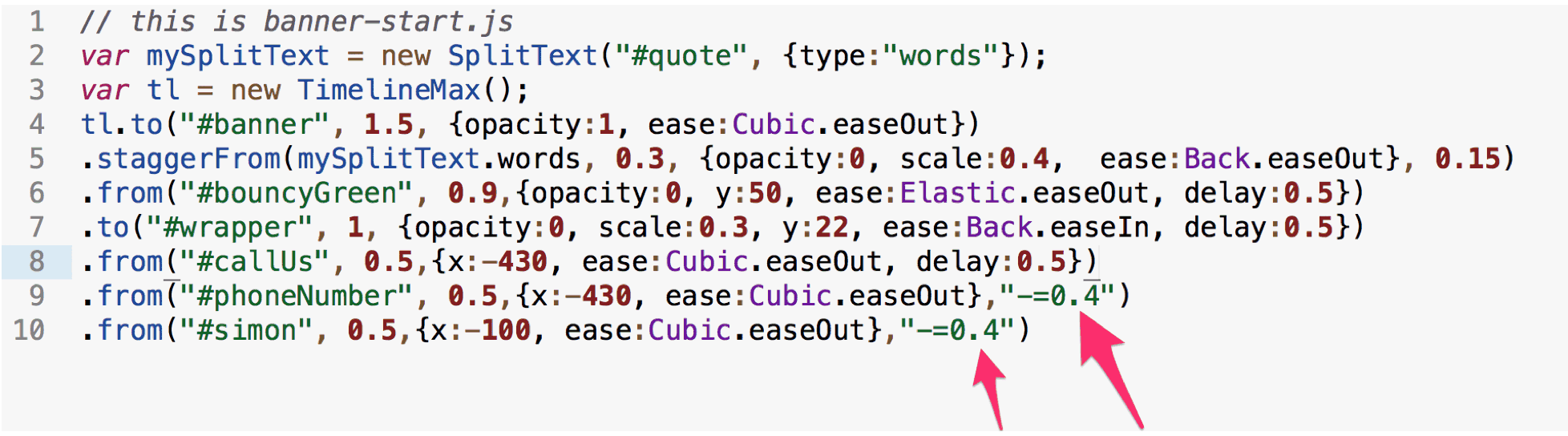
What I’ve inserted is a comma followed by a string value (data inside double quotes) that acts as a reverse delay. Instead of letting each element animate sequentially, and or after a delay value, I’ve used this string value: “-=0.4”. This means, take the current time at which it would have animated, and make it equal to that time after the browser has subtracted four tenths of a second from that time. This allows us to have something happen during, or even before the previous animation command. Bottom line is that these string value delays allow concurrent and or overlapping animation movements.